We have the opportunity to work across the United States on housing needs assessments, and one of the questions we get is, “which places are the leaders in achieving low levels of cost burden?” So, here is an attempt to answer that question.
We measure cost burden by adding together all households spending more than 30% of their income on housing, whether it is rental or ownership, using the ACS 2022 (5-year) as our data source. We then divide the number of cost burdened households by the total number of households. In the charts below, this is per county for all counties in the United States with more than 1,000 households.
Before we get into the detailed analysis, the objective winner is: 🏆 Winkler County, Texas, with 7.3% cost burden, 2,685 households, a median family income of $89,155, and a Gini Index of 0.3 (more on that later). Good job, Winkler County, Texas! The other counties with sub 10% levels of cost burden are Calhoun County, West Virginia, Bowman County, North Dakota, and Calhoun County, Arkansas. All of these counties have less than 3,000 households.
As it turns out, there is a strong relationship between number of households and cost burden, with larger population counties experiencing more cost burden, as shown below.
It is hard to see the smaller counties, so here is the same data with a logarithmic axis of households. Here we can see some other counties that are significantly below the expected level of cost burden for their size.
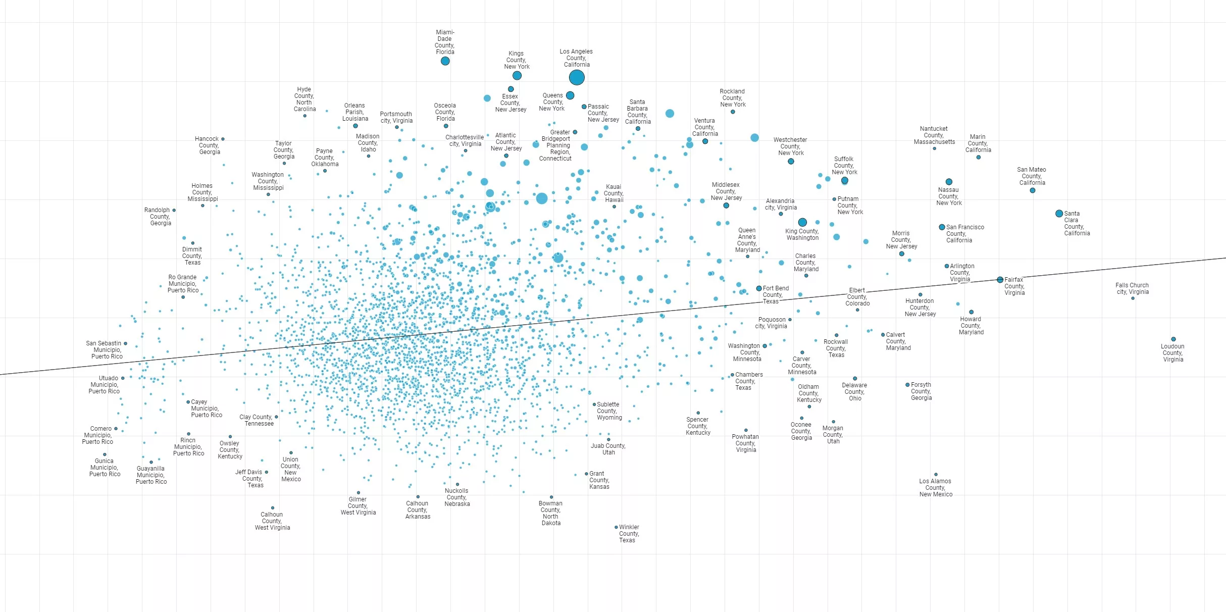
But what is the relationship between cost burden and household income? Here we can see that there is a relationship, but it is not as strong as the population size. Counties that have higher-than-average incomes and low levels of cost burden include Los Alamos County, New Mexico, and Loudoun County, Virginia.
Comparing household income to cost burden could be misleading, however, because it might cover up exclusionary housing policy that creates barriers to access for low income residents. To account for that, we can compare cost burden to the Gini Index. The regression line here shows that as income inequality goes up, so does level of cost burden. Counties with low cost burden and an equitable distribution of incomes are on the bottom left of the chart, such as Beaver County, Utah, Bowman County, North Dakota, and Calhoun County, Arkansas.
In another post, we'll take a look at which places have had the strongest rates of change in cost burden along with other indicators, such as population growth, and explore the correlation between housing policy and cost burden that may be influencing the rate of change.