CommunityScale transforms datasets into actionable intelligence. Our digital products use interactive visualizations and mapping tools as stand-alone objects or in one of our online report dashboards. In today’s digital age there are unprecedented opportunities for leaders to leverage data to enhance community wellbeing across social, financial, and inclusivity dimensions.
We partner with clients to deliver:
- Custom monitoring platforms that capture housing trends, support evidence-based advocacy, and evaluate initiative success
- Dynamic modeling tools that forecast how zoning and development decisions ripple through communities, affecting affordability, business vitality, and local economics
- Compelling digital experiences that reimagine traditional urban planning documents, connecting residents with federal resources, highlighting investment potential, and forecasting neighborhood evolution
Our solutions empower decision-makers to harness the pulse of urban life, translating raw data into meaningful improvements for all city dwellers.
Open source report dashboards
Follow CommunityScale on GitHub as we release open source report dashboards that are optimized for desktop and mobile viewing.
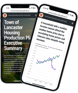
This example is the Town of Lancaster Housing Production Plan Executive Summary. There are several advantages to our open source solution — the site will be hosted for free indefinitely, and if a client wants to, it can migrate the source files (HTML and CSS) onto their server.
Real time indicators
In response to our clients asking how they can track housing conditions in real time, we’ve developed an approach that incorporates the latest housing data into charts and insights.
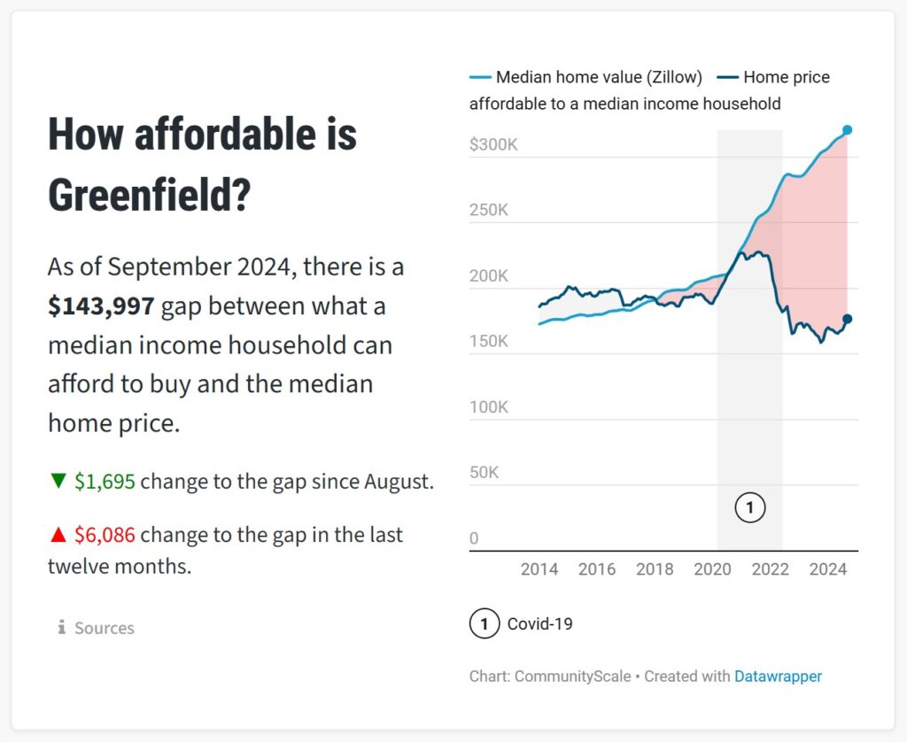
This example tracks housing affordability and attainability for Greenfield, MA. We pull variables from Zillow for median home price, Census for median household income, and FRED for the latest mortgage rates. The script then estimates the gap between what the median household can afford to buy and the median sales price for a given area.
Interactive graphs
We’ve been honing our charts to deliver the most insights in the most efficient manner. One of the ways to add bandwidth is to make the chart interactive. Hover over this chart to see an example:
Social media assets
Clients have asked us for bite size media assets that can communicate the core issues of a plan or study for posting on Facebook, Instagram, LinkedIn, or other social media platforms.
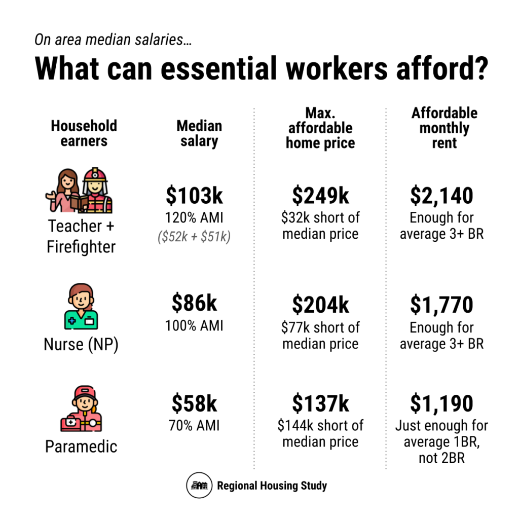
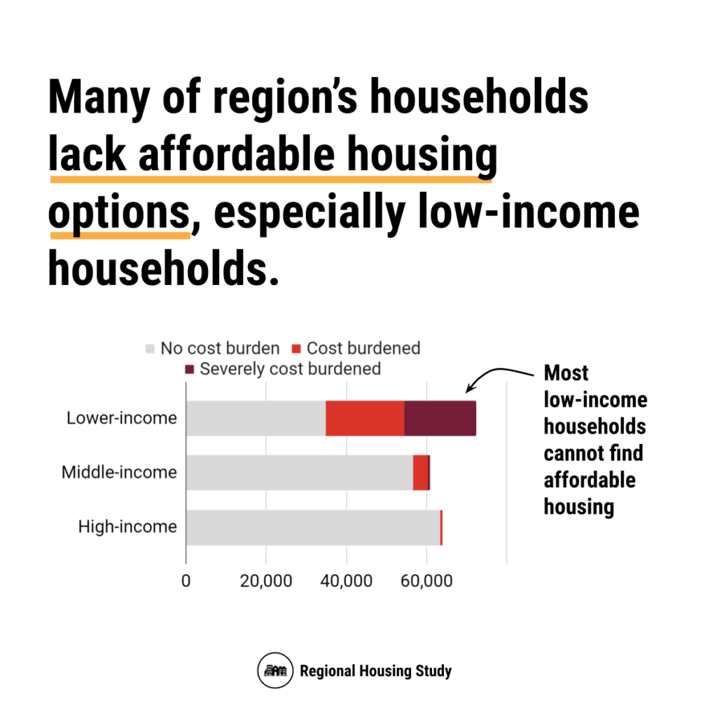
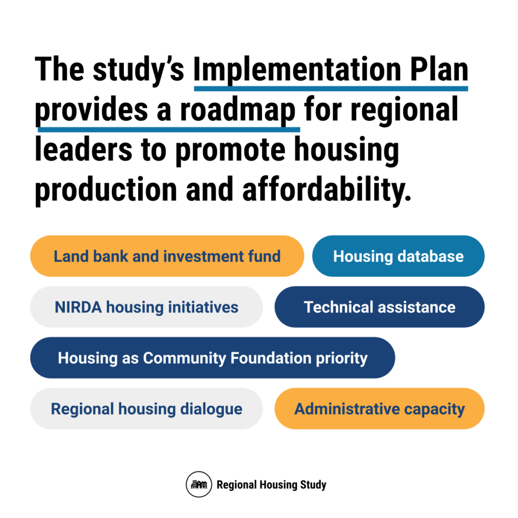
To address this need, we've developed square image templates, language, and assets that we can apply to get points across efficiently.
